To follow up on the previous post, here is a Fred graph comparing various measures of homebuilding.
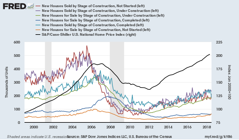 |
| Source |
Sorry, it's a bit messy. The orange line at the bottom is homes built speculatively which have not been started yet. The dark blue line at the bottom is completed homes that have not been sold. This is one source of the "overbuilding" story. Speculative building increased, basically in line with general growing sales. The trend in speculative buying reversed soon after general sales started to decline, but it wasn't enough, and so homes that were completed without a buyer started to rise. The green line is speculative homes under construction, and it begins to decline in 2006, but not quickly enough. That is the extra inventory that might be blamed on overbuilding.
But (you knew there would be a "but"), notice the scale of the problem. Even at 200,000 units, the level of unsold inventory should have amounted to just a few months' sales. The only reason they amounted to much more than that was because sales had collapsed. It was the collapse in demand that was the shock, not an oversupply.